Design for the maintenance workers
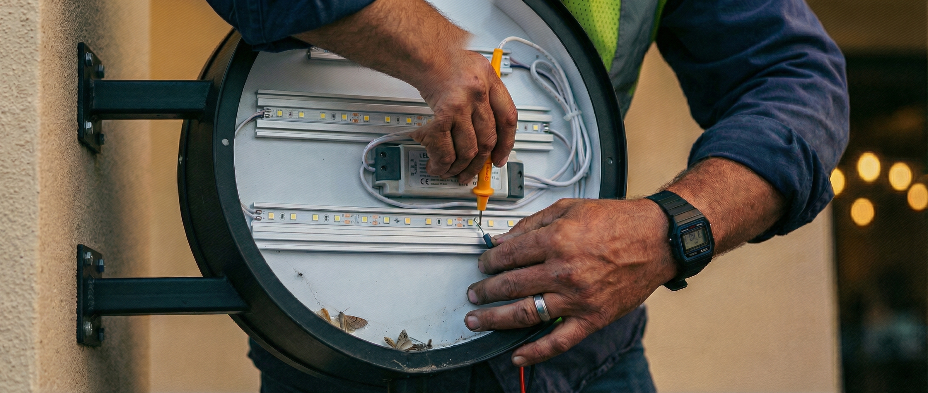
We ask this on every project now: how does this sign get opened, cleaned, and serviced without shutting down a hallway, blocking traffic, disassembling half of it in the field, or removing it entirely?
Nobody thinks about the dude on the ladder.
The architect specs a beautiful flush-mounted blade sign in a two-story atrium. The designer nails the proportions, the client signs off, everyone's happy. And then eighteen months later, two of the LEDs are dead, the face has a yellow tint from dust buildup behind the acrylic, and the whole thing looks like it belongs in a strip mall.
The sign wasn't poorly made, it failed because nobody thought about how it'll get serviced.
THE FIRST QUESTION
We ask this on every project now: how does this sign get opened, cleaned, and serviced without shutting down a hallway, blocking traffic, disassembling half of it in the field, or removing it entirely? If the answer involves serious logistics, shutdowns, or hours of labor just to swap a power supply or change a face or graphic, that's less a maintenance plan than a guarantee the sign won't get maintained.
WHAT ACTUALLY HAPPENS
Facilities teams work on budgets and schedules that don't have room for a full-day sign repair, so the dead LEDs stay dead, the yellowed face stays yellowed, and the scuffed base never gets touched up. Two years in, a $250,000 sign program looks like nobody cares about the building. At that point, honestly, the perception is the reality.
SMALL MOVES
Hinged faces instead of fastener-secured panels... Service access from the back instead of the front... LEDs rated for 100,000 hours instead of 50,000... Standard sizes that match replacement parts already in the supply chain... None of these add real cost to a project. All of them decide whether the sign still looks right in year five.
Design the sign for the person who has to keep it alive. That's the spec most people forget to write.
Keep reading
Why old signs feel like they're more honest
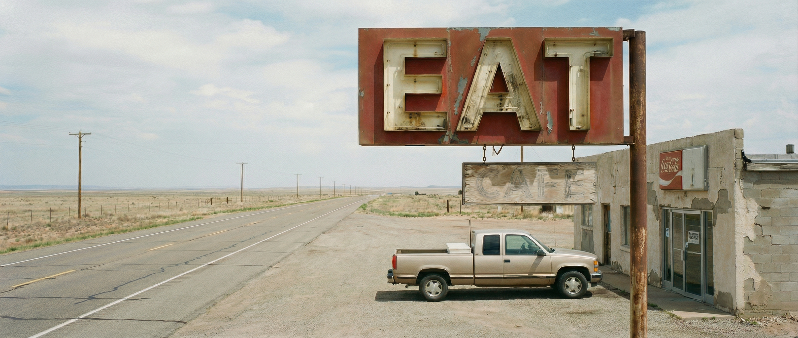
Old signs didn't have brand strategy. They didn't have design systems or mood boards or a 46-page identity guide specifying corner radius and exclusion zones. They had a message and a budget. "MOTEL." "GAS." "VACANCY." "COLD BEER."
Design for the person who's already late and slightly panicked
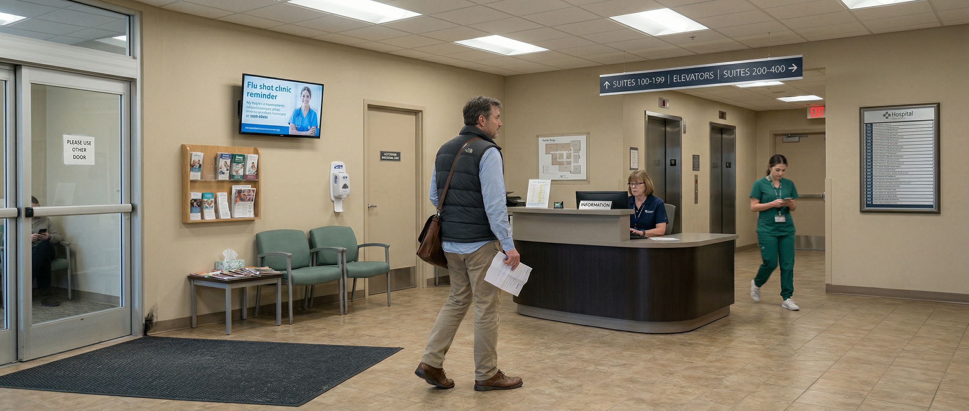
Most wayfinding systems are designed for a person who doesn't exist. Someone calm, focused, walking at a moderate pace with nothing on their mind except getting from point A to point B. Someone who stops at the directory, reads it line by line, and proceeds with full confidence.
Your tenant signage criteria is killing your tenants' businesses
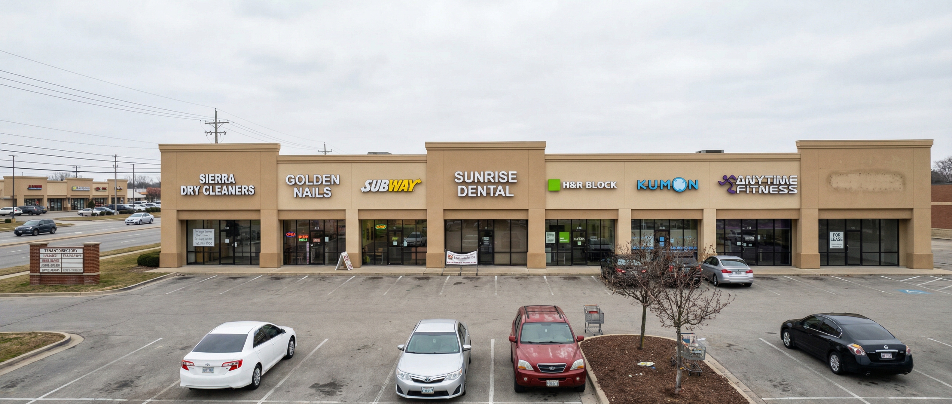
I need to talk to property managers and commercial landlords for a second. That tenant signage criteria document you hand out, the one that specifies maximum letter height, approved fonts, color restrictions, illumination limitations, and approved sign types, I understand why it exists. You want the property to look cohesive, professional, and controlled.
Good signage
starts with a conversation.
Every project is different. Let’s talk about yours.