Your tenant signage criteria is killing your tenants' businesses
I need to talk to property managers and commercial landlords for a second. That tenant signage criteria document you hand out, the one that specifies maximum letter height, approved fonts, color restrictions, illumination limitations, and approved sign types, I understand why it exists. You want the property to look cohesive, professional, and controlled.
I need to talk to property managers and commercial landlords for a second.
That tenant signage criteria document you hand out, the one that specifies maximum letter height, approved fonts, color restrictions, illumination limitations, and approved sign types, I understand why it exists. You want the property to look cohesive, professional, and controlled.
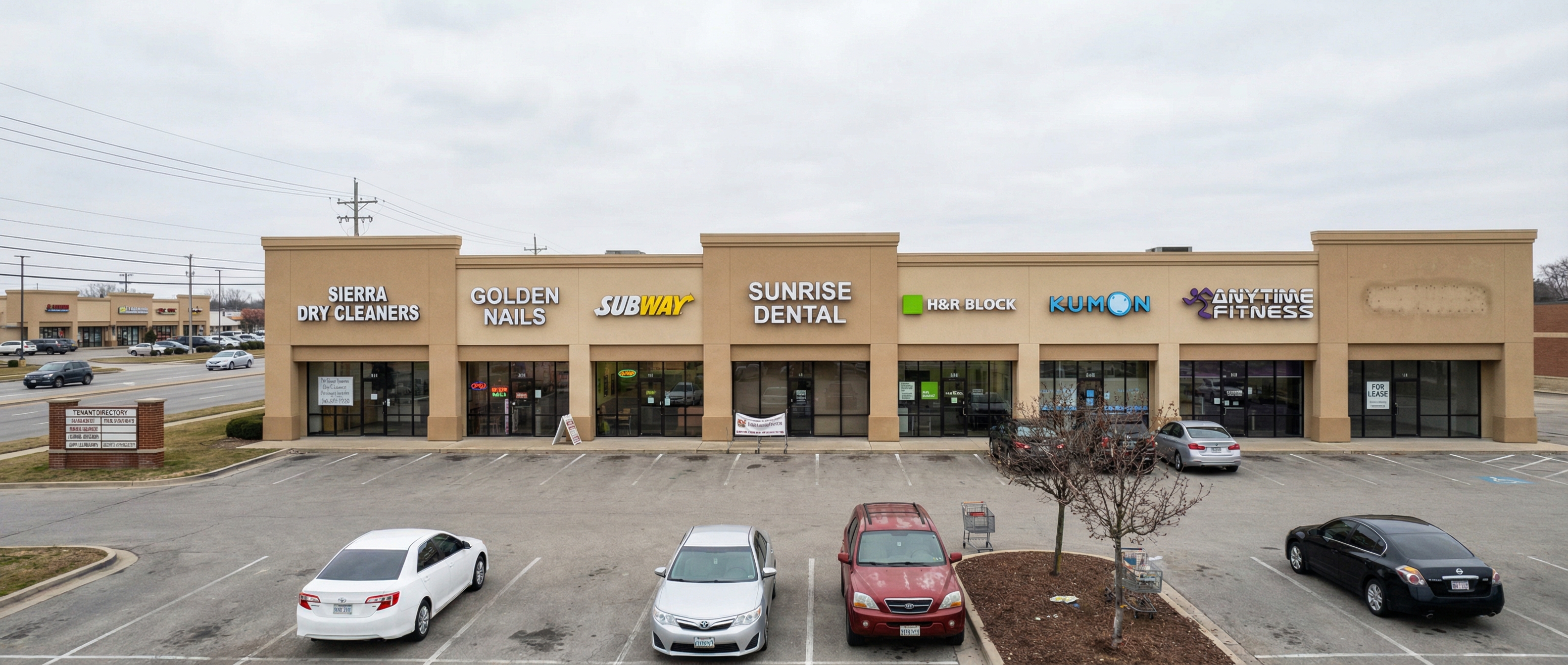
But here's what's actually happening: you're forcing a taco shop, a nail salon, a pediatric dentist, and an insurance broker to all look like the same business. Same letter height. Same channel letter style. Same mounting location. Sometimes the same color palette. Everyone gets the same 24" white channel letters on a raceway and calls it a day.
The tenants don't stand out. They can't differentiate themselves. Their customers can't find them from the road because every sign on the building looks identical from 200 feet away. And when a tenant can't attract foot traffic and closes after 18 months, the landlord blames the market.
It wasn't the market. It was the sign criteria.
We've reviewed a lot of these documents over the years. Some are perfectly reasonable. A lot of them have provisions that quietly strangle a tenant's ability to market their own business. Things like:
- Maximum letter heights of 18" to 24" on a building face visible from a 45 mph arterial, where you need at least 36" of letter height to read a business name at speed
- A single approved font (usually something geometric and generic like Helvetica or a knockoff) applied equally to a steakhouse, a daycare, and a tax prep office
- "White or off-white illumination only" restrictions that prevent a business from using their brand colors in any lit sign application
- No logos, symbols, or graphic elements, text only, which eliminates a huge portion of how modern brands identify themselves visually
- Rigid raceway-mount requirements that prevent individual letter installations, making every sign look like it was installed by the same contractor on the same Tuesday
- Blanket prohibitions on neon or exposed LED that apply even to tenants where that aesthetic is part of their identity (a cocktail bar, a vintage shop, a tattoo studio)
- Maximum square footage calculated by frontage that doesn't account for tenants with angled or recessed entries, which can cut their allowable sign area nearly in half
None of these provisions are malicious. They come from a legitimate place. But they were probably written once, years ago, by someone trying to solve a different problem, and nobody's looked at them since. Here's what workable criteria actually looks like:
- Set maximums based on visibility distance, not arbitrary letter heights. A tenant on a pad site visible from 300 feet has different needs than a tenant inside a mall corridor.
- Allow brand colors and fonts within the approved illumination types. "We allow channel letters, dimensional letters, and backlit cabinets, and tenants may use their own brand colors within those formats" gives you control without killing individuality.
- Approve on a case-by-case basis for specialty tenants. A single-page exception process takes less time than a vacancy.
- Give tenants a sign designer contact, or require a design review before fabrication. That way you see exactly what's going in before it goes in, and you can catch problems before they become installed problems.
- Build flexibility into mounting options. Requiring prior approval for non-standard mounting is reasonable. Requiring raceways on every tenant because it's easier to approve is not.
- Review your criteria every few years. The sign industry changes. Brand standards change. What made sense in 2009 might be costing you tenants in 2025.
I'm not saying go full Vegas on a Class A office park, but there's a middle ground between visual chaos and forcing every tenant into the same beige straitjacket. Let them have some personality... Let the signage do what it's supposed to do, identify a business and attract customers. That's the whole point.
A property with thriving tenants is worth more than a property with "consistent signage" and 40% vacancy.
Good signage starts with a conversation.
Every project is different. Let’s talk about yours.