
Channel letter sign design
The workhorse of the fascia
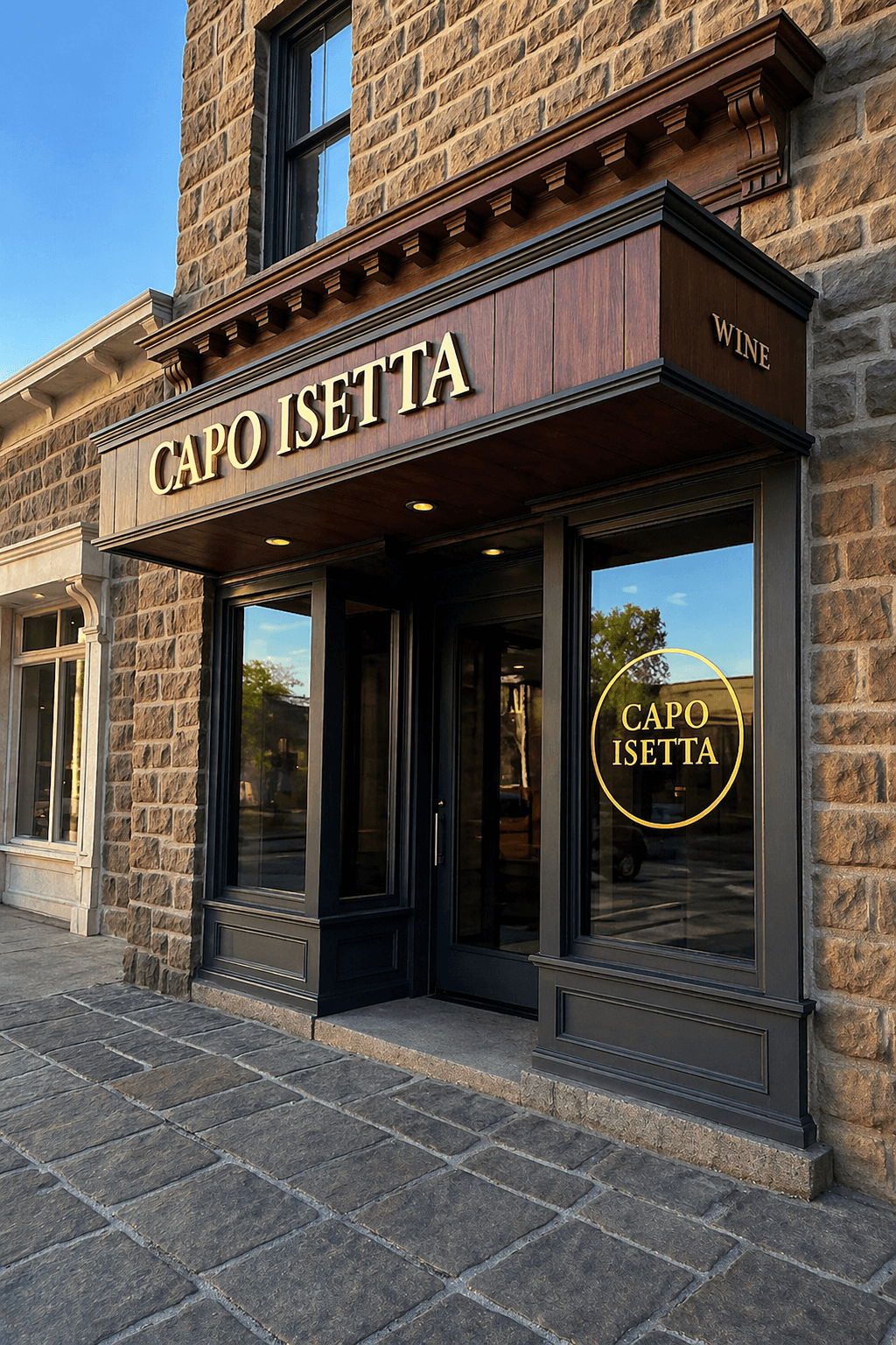
A channel letter is a small piece of sheet-metal construction: an aluminum can bent to the letter's shape, a return that gives it depth, an acrylic face or an open back, and LED modules doing the lighting. Multiply that by every letter in the name and you have a sign that reads crisp at distance, survives weather, and carries most of the commercial identity in any city you drive through.
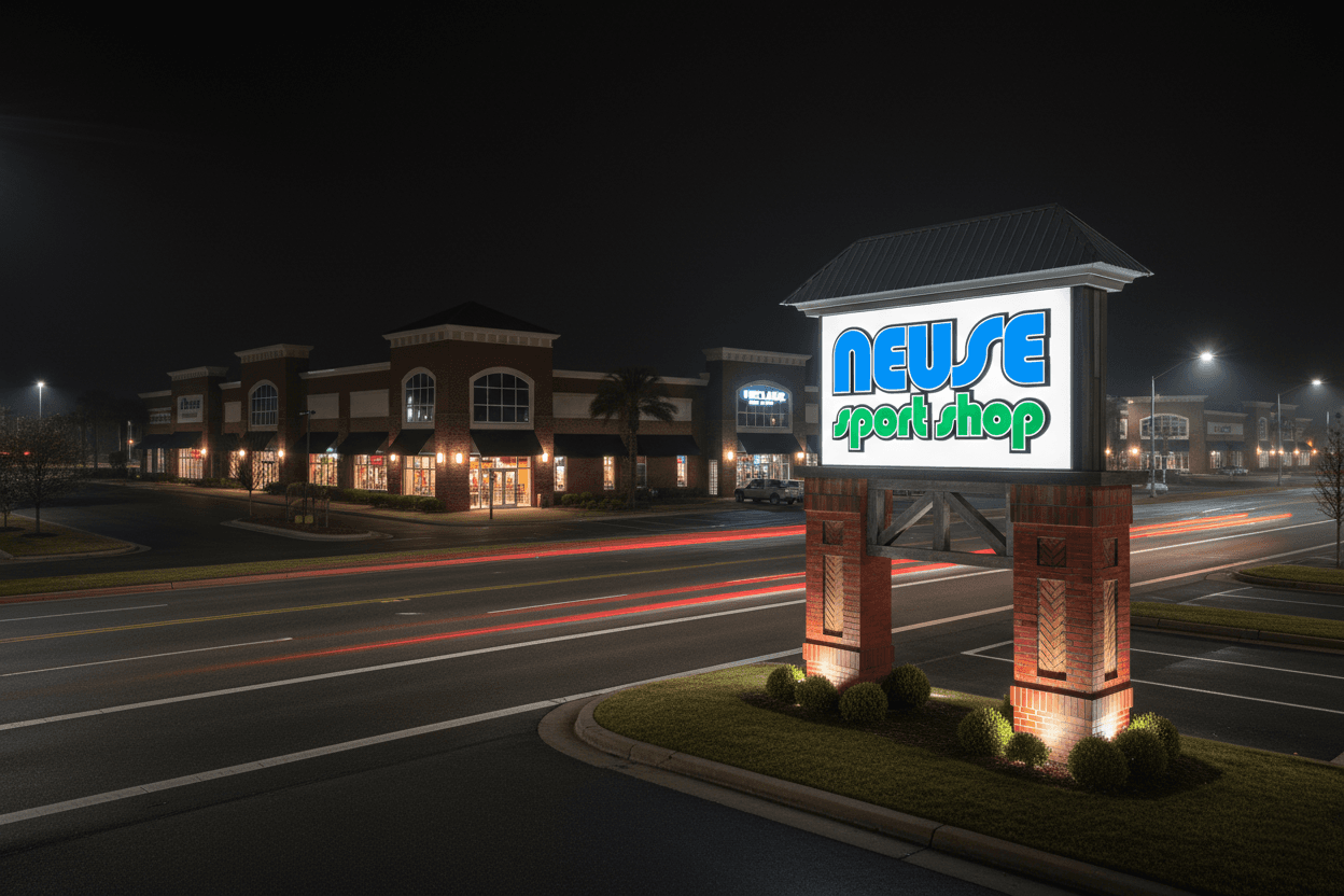
We design the letter set against the actual building and draw the detail everyone downstream needs. We don't fabricate or install, and the set is drawn so any qualified shop can bid it. It's one branch of our exterior signage work.
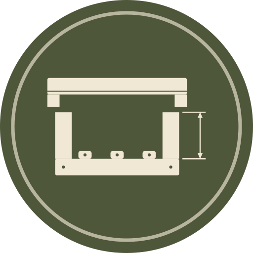
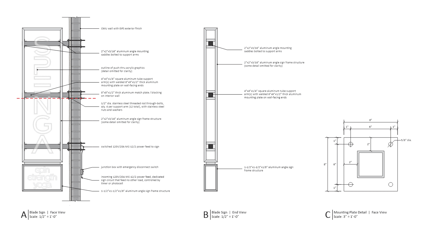
Letter section detail
Return depth, trim, face, and LED layout drawn in section so the shop builds the letter we designed.
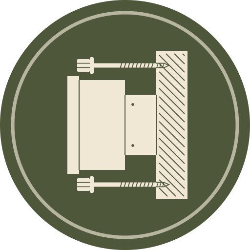
Mounting and attachment
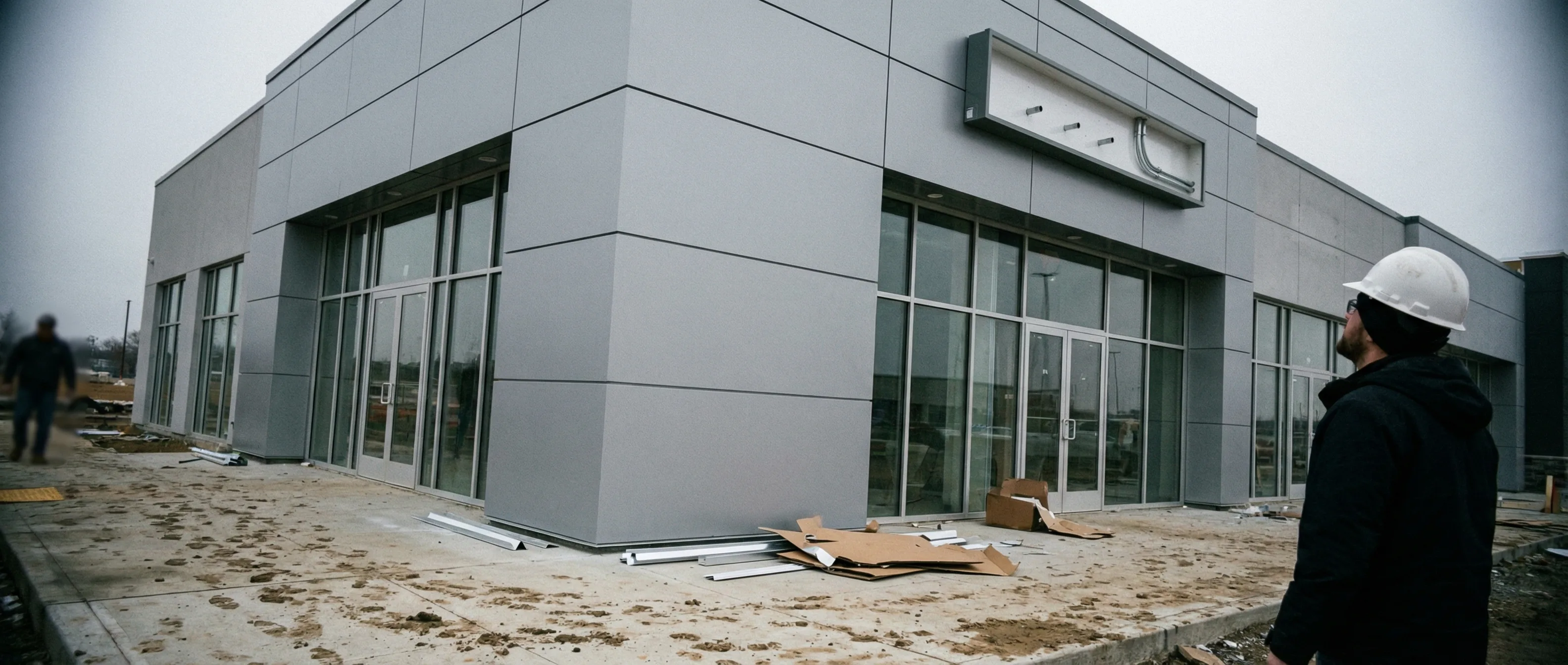
Flush, raceway, or wireway mounting detailed for the actual wall construction, with penetrations counted.
Electrical
Load, transformer locations, and the power stub-out drawn so the electrician and the shop meet at the same spot.
Code and criteria
Sign area calculated the way the ordinance counts it, and the landlord's criteria met before submittal.
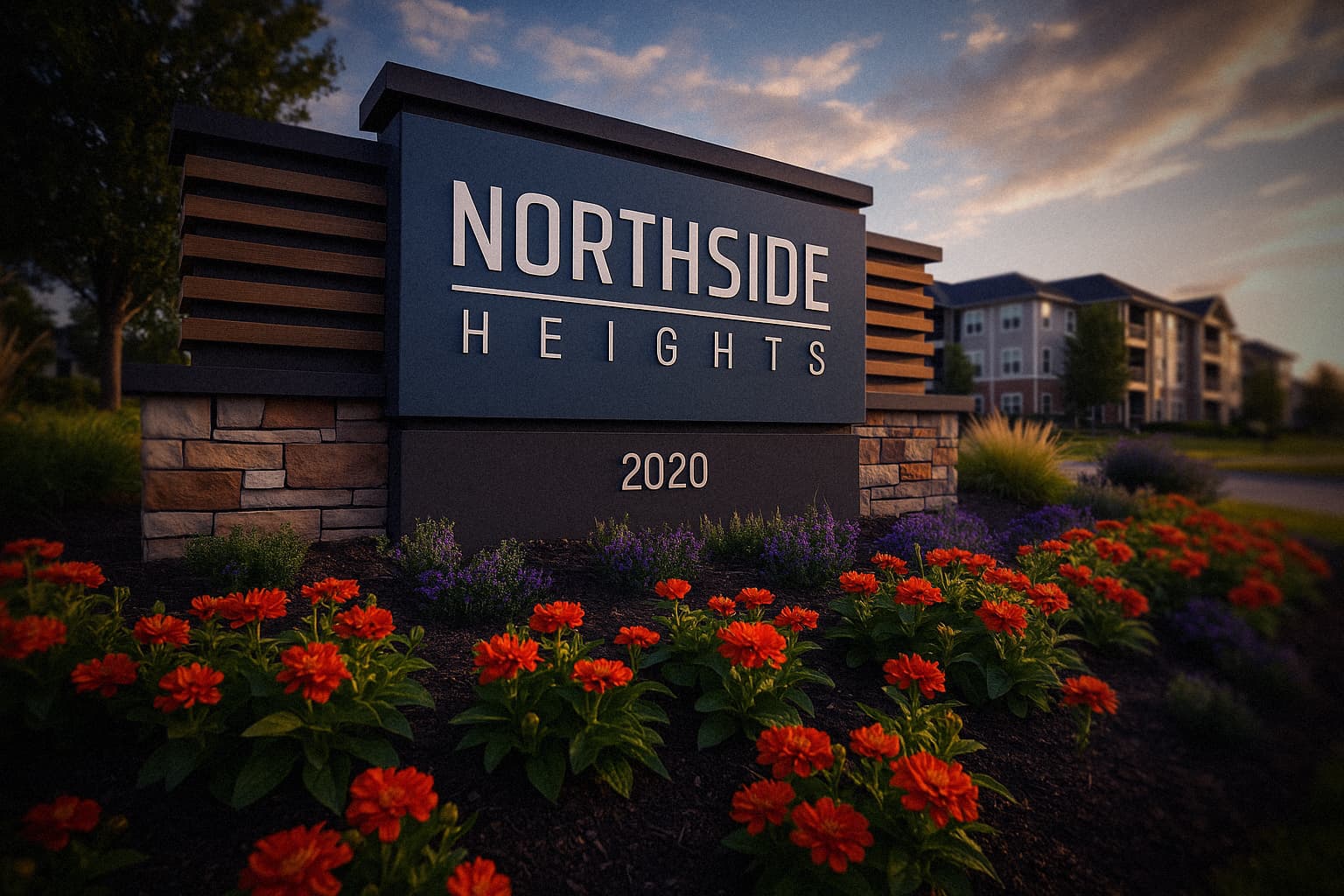
Letter height
Cap height worked back from the read distance and capped by code, not scaled up from the logo file.






Who we work with

Sign companies
White-label design and drawings for busy shops. We draw, you fabricate, and your client never knows we were involved.


Architects & designers
Signage and wayfinding documented to sit inside your set, on your schedule, drawn to the standard your drawings hold.

Facilities & property teams
Wayfinding and sign standards for campuses, portfolios, and multi-building sites that have outgrown the signs they started with.
Brands & retailers
Sign programs that hold the brand across every location and bend to each local code, without ever losing the look you built.
Channel letters, answered

Didn't find your question? Ask us directly — straight answers, no runaround.
- Face-lit or halo-lit, how do we choose?
- Face-lit letters glow through an acrylic face and read loudest at distance, which is why retail leans on them. Halo-lit letters throw light backward onto the wall and read as quieter and more premium, which is why offices, hospitality, and brands with serifs lean that way. The building's architecture, the ambient light, and the brand's weight decide it, and we render both on the actual elevation when the call is close.
- What's a raceway, and why does the landlord require one?
- A raceway is the horizontal box the letters mount to, carrying the wiring and transformers inside it. Landlords require them because a raceway means a handful of wall penetrations instead of dozens, which matters when your tenant moves out and the wall needs patching. It changes the sign's look, so we draw the raceway painted to the fascia and sized to disappear as much as the criteria allow.
- How big should the letters be?
- Worked back from the read distance, not up from the logo file. A rough field rule is one inch of letter height per ten feet of read distance, so a storefront read from a parking lot at 150 feet wants letters in the 15-inch range, and a fascia read from a highway wants several times that. Then the sign code and the landlord's criteria cap what the math asked for, and the design negotiates the gap.
- What does channel letter design cost compared to fabrication?
- Design and documentation are a small slice of the project, usually a few hundred to a couple thousand dollars against a fabricated-and-installed set that commonly runs $8,000 to $17,000 on a strip center. The drawing is the cheap part that keeps the expensive part from being built wrong, remade, or bounced at permit.
Read more
Good signage
starts with a conversation.
Every project is different. Let’s talk about yours.