Design for the person who's already late and slightly panicked
Most wayfinding systems are designed for a person who doesn't exist. Someone calm, focused, walking at a moderate pace with nothing on their mind except getting from point A to point B. Someone who stops at the directory, reads it line by line, and proceeds with full confidence.
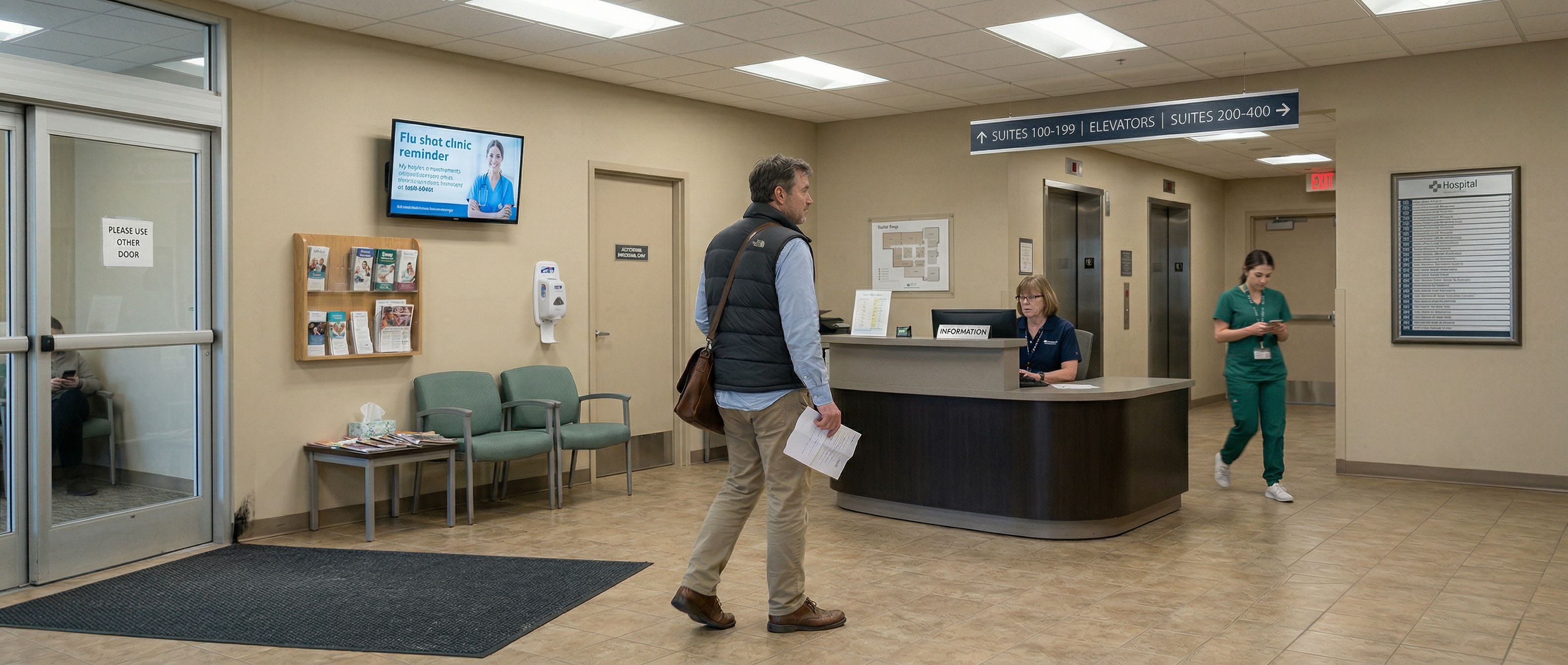
I watched a guy walk into a medical building last Tuesday. Late for his appointment, phone in one hand, insurance card in the other, scanning the lobby like he was trying to solve it. There were signs everywhere. Directory by the elevator. Directional plaques on every corridor. Floor numbers on the stairwell doors. Good system. Thoughtfully designed.
He walked right past all of it and asked the security guard.
THE CALM USER PROBLEM
Most wayfinding systems are designed for a person who doesn't exist. Someone calm, focused, walking at a moderate pace with nothing on their mind except getting from point A to point B. Someone who stops at the directory, reads it line by line, and proceeds with full confidence.
That person is maybe, like, 20% of your foot traffic on a good day.
The other 80% are running late, distracted by a phone call, carrying something awkward, worried about parking, or walking into a building they've never been in while their stress response is quietly eating their ability to process new visual information. Research on cognitive load and spatial navigation backs this up. A 2011 study out of the University of Michigan found that stress reduces wayfinding performance by roughly 30%, with test subjects missing signs they looked directly at. Not signs that were hidden. Signs they literally had their eyes on.
Your system was tested by a designer sitting in a chair looking at a reflected ceiling plan, it was never tested by someone whose blood pressure spiked in the parking garage a few minutes prior.
DESIGN FOR THE WORST MINUTE
The fix isn't more signs, it's designing the system around the worst version of the user's experience, not the best. That means bigger type at decision points, not because the viewer has bad eyesight, but because a stressed brain needs 40% more contrast and scale to register information at the same speed. It means fewer options per sign, because a panicked reader scanning a list of twelve suite numbers will default to asking someone before they'll parse all twelve. It means confirmation signs after turns, because a person who just made a decision under pressure needs reassurance that they chose correctly before they can process the next one.
Think of it like designing a user interface for someone using their phone on a crowded subway. You wouldn't put eight navigation options on that screen. You'd give them two, maybe three, with clear visual hierarchy and generous tap targets. Same principle, different material.
WHAT CHANGES
Start the design brief with a stress profile, not a floor plan. Ask who's coming into this building, what state they're in when they arrive, and what's the worst realistic scenario for their attention. A courthouse lobby and a spa lobby need fundamentally different wayfinding strategies, even if the buildings are the same square footage.
Keep reading
Design for the maintenance workers
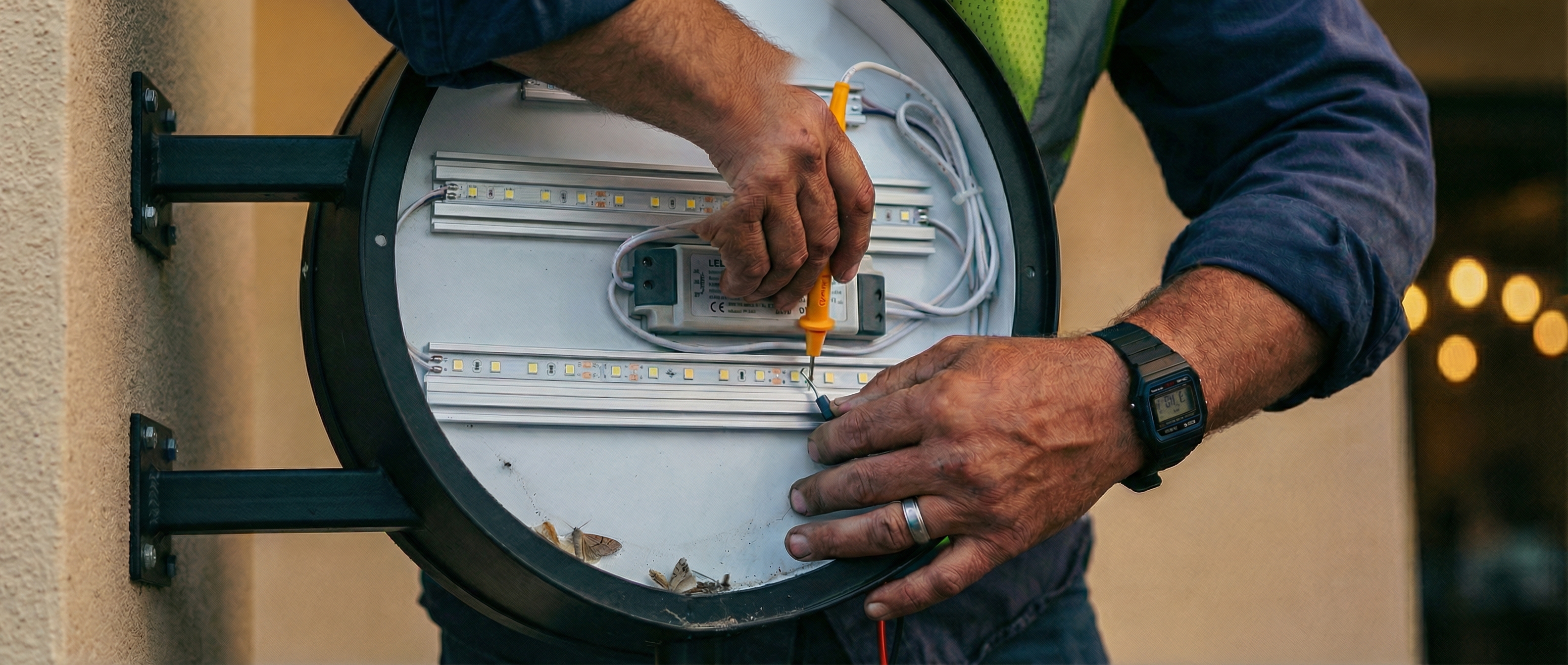
We ask this on every project now: how does this sign get opened, cleaned, and serviced without shutting down a hallway, blocking traffic, disassembling half of it in the field, or removing it entirely?
Why old signs feel like they're more honest
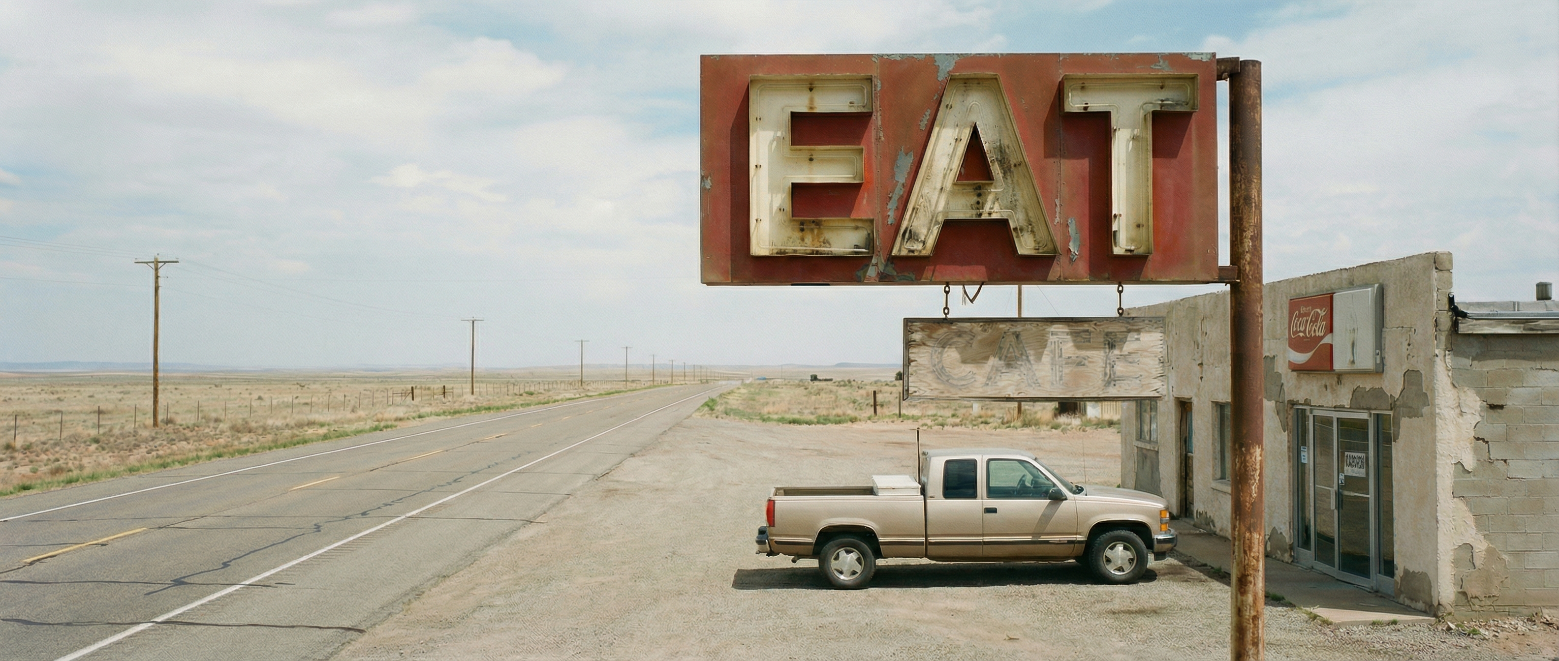
Old signs didn't have brand strategy. They didn't have design systems or mood boards or a 46-page identity guide specifying corner radius and exclusion zones. They had a message and a budget. "MOTEL." "GAS." "VACANCY." "COLD BEER."
Your tenant signage criteria is killing your tenants' businesses
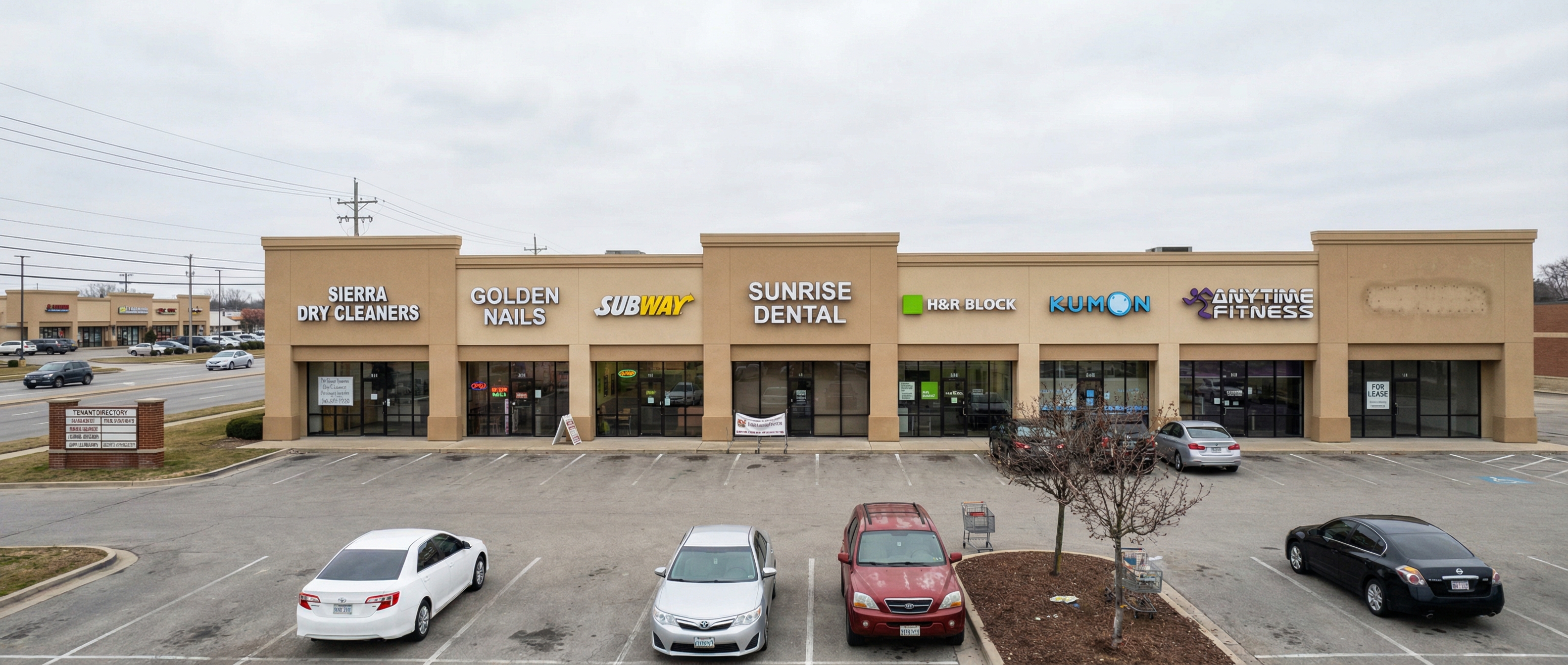
I need to talk to property managers and commercial landlords for a second. That tenant signage criteria document you hand out, the one that specifies maximum letter height, approved fonts, color restrictions, illumination limitations, and approved sign types, I understand why it exists. You want the property to look cohesive, professional, and controlled.
Good signage
starts with a conversation.
Every project is different. Let’s talk about yours.